California State University, Sacramento
Information Resources & Technology Division
Information Resources & Technology Division
Roommate Finder App
Objective
Diagnose the existing userflow, interface and overall user experience, and provide an actionable solution to improve usage, then create a hi-resolution/interactive prototype along with suggested user flow diagram to communicate my recommendations.
Process & Train Of Thought
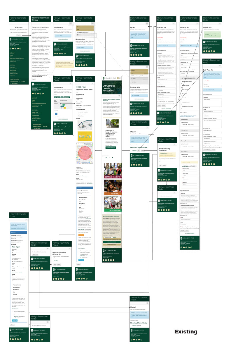
New to this product, my initial step was the inventory of the existing app footprint and producing a user flow tree of all screens. With this high level overview in place, it was then possible to identify redundancy in the conversion process, excess content and ‘friction,’ and various symptoms of poor design hierarchy, copywriting and more. The remediation process resulted in the second workflow diagram and the interactive mock-up of a single user path (browse and choose a rental).
Colleagues & Teammates
The project was ordered by the Director of Web and Mobile Services, who provided direction and prioritized institutional focus. I was the lone designer working on this assessment.
Visual Ability
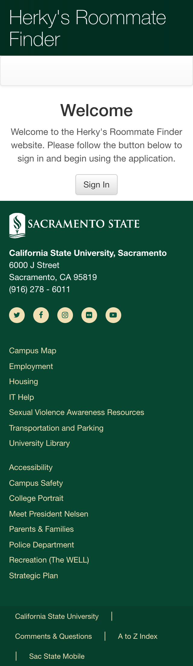
The original design was much more a responsive ‘copy’ of a desktop website fed through a native wrapper (a la Cordova). I applied user-first principles to create a more conversion-focused flow across single-action screen designs to reduce cognitive dissonance while applying more usable click-areas, font-sizes and negative space to make much of the remaining content easier to navigate.
Solution
My visual design recommendations eliminated the redundant web architecture not specifically related to the process of finding a roommate. removing this extra distraction allowed for more single-screen interactions that conceal the technical limitations of the platform.
Tools & Skills Used
The userflows are simply screencaptures assembled in an InDesign layout, while the interactive prototype was created using Adobe XD.
Results
As the project was speculative in nature, these changes have not yet been made to the live copy of the application.
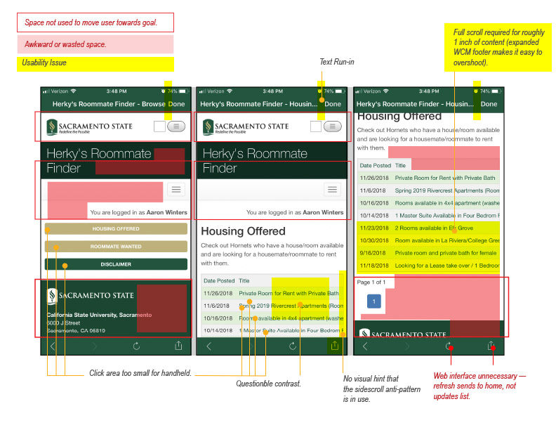
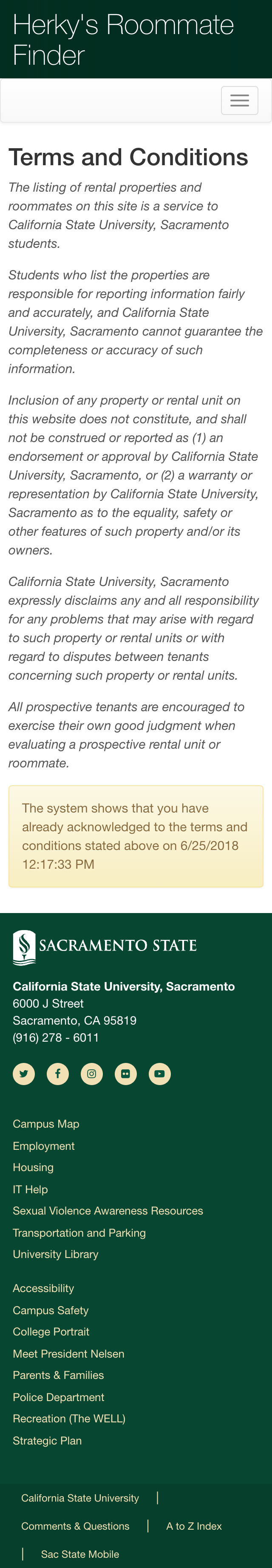
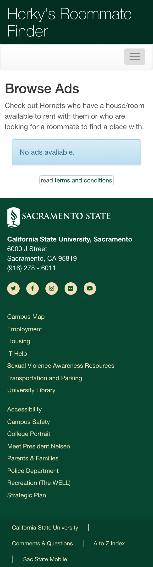
Existing Design
Below are screencaps from the existing app, essentially a set of pages using the site's full desktop layout, set responsively within a 'native' wrapper. Much of the footer includes information less akin to a specialized native app with considerable scrolling as well as certain telltale signs of default Bootstrap visual elements.
Initial Review: User Flow
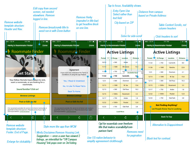
After taking inventory of the existing footprint and identifying redundancies, I re-architected the user experience in a far more lean application. Fewer screens, fewer clicks means a more agile user flow.
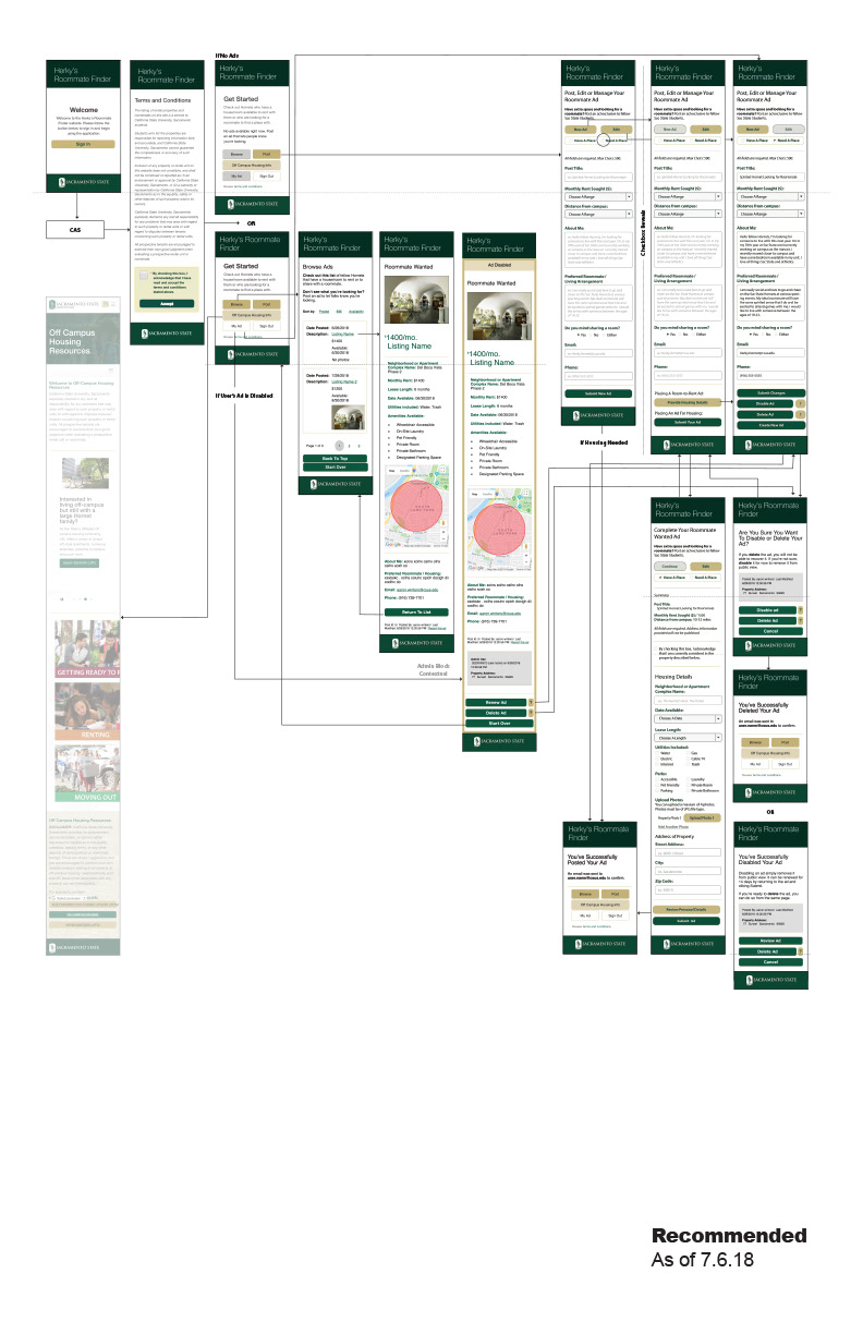
Design Critique
First diagnosing issues with the existing screen design(s), I then prepared a series of proactive adjustments to make that would improve the in-screen experience while facilitating the reduced footprint.