SacSurfacePro
Identity & Print Campaign
Matt Pentecost services hard surfaces (granite counters, glass showers, etc.) in the Sacramento area. His SacSurfacePro outpaces its competitors through education, service and reputation.
Goals
While focusing on cleaning brought success during the recession, Matt has set his sights on sealing new homes going forward. The project intended to differentiate SacSurfacePro against discount competitors while easing the approach to corporate builders.
Process
The redesign shifts focus from commodity to benefit. Targeting upper-middle class women, the initial concepts drew influence from cosmetics and fashion. My research suggested abandoning the predictable ‘swashes’ and blue of the existing branding. The client opted towards incremental improvements with more continuity.Working within that constraint, custom text treatments based on the Avenir Next typeface refined the more basic Futura wordmark. I re-tooled his icon only slightly, bringing improved symmetry and cleaner curves.Given more leeway, the suite of print materials was completely re-imagined. Beginning with an updated color palette, the primary blue shifts towards a more energetic teal and stately cobalt. Geometric and natural textures further add an appropriate dimension and tactility. A spot varnish raises the profile of key formal elements while implying the protective sheen of a freshly-sealed surface.
Outcomes
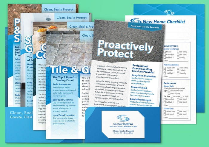
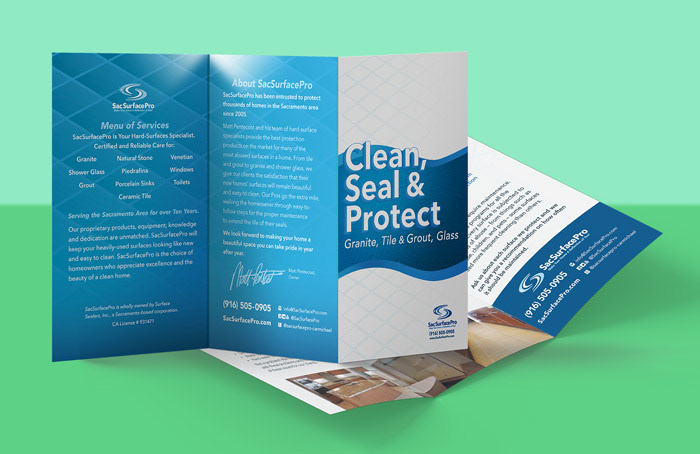
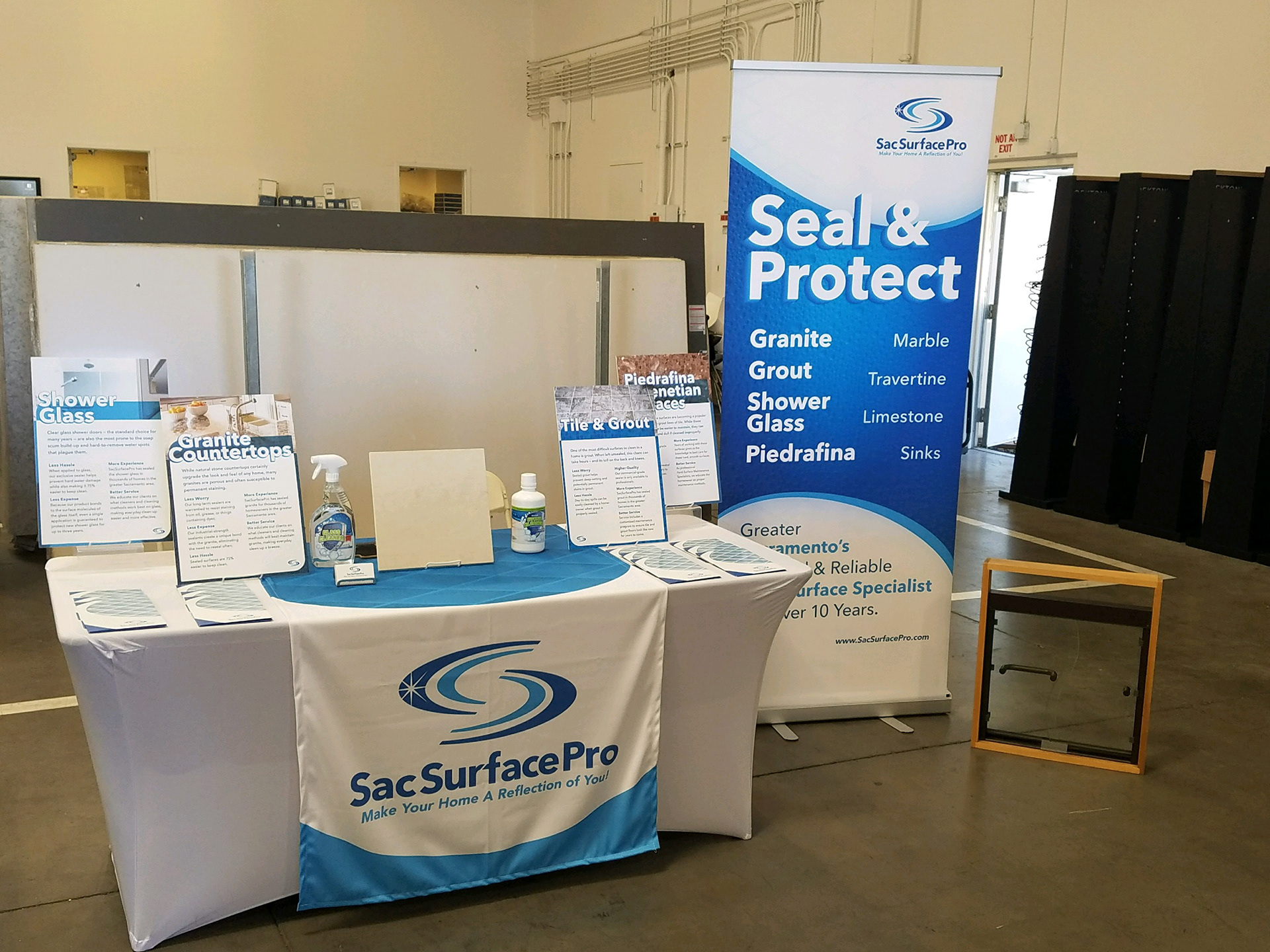
A presentation folder, exhibition signage, brochures, forms and vehicle window wrap currently use the updated visual system. The work successfully satisfies the client’s more conservative approach while moving the brand towards elegance.


(above left) Rather than a single capabilities brochure, a series of interchangeable 6x9" flyers can be assembled, along with business card and estimating worksheet that addresses the contacts specific need directly. (above right) Abandoning the tired tri-fold brochure most businesses default to, I designed a 6x9" on card stock that ties in with the rest of the series awhile bringing substantial weight and elegance to the piece.


