California Landscape Contractors Association
Water Management Certification program
Water Management Certification program
Identity & Print Campaign
California Landscape Contractors Association is a statewide professional organization representing and improving the professionalism of licensed landscape contractors and the associated industries through education and networking events. Their Water Management Certification program was newly created in response to the deepening water crisis in California. The Water Management Program a two-pronged mission of training and certifying landscape professionals in water management best practices, as well as promoting their skills and professionalism to homeowners through print materials and consumer outreach at home shows throughout the state.
Deliverables
I provided art direction, graphic production and web design for the distinct halves of the program’s outreach. The campaign used direct-mail and email flyers and postcards supported by tradeshow exhibit graphics.
Goals
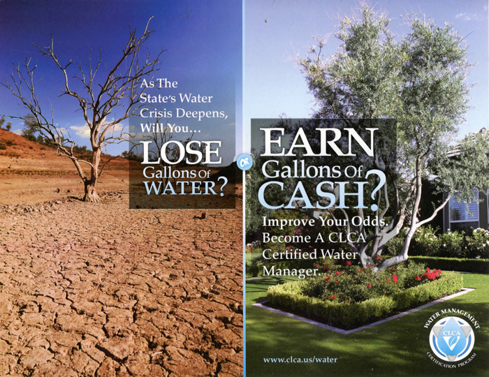
The marketing to licensed landscape professionals made the case for using the drought as an opportunity to diversify during the recession, and to evolve their best practices as the water crisis made traditional lawnscapes difficult to justify and maintain.
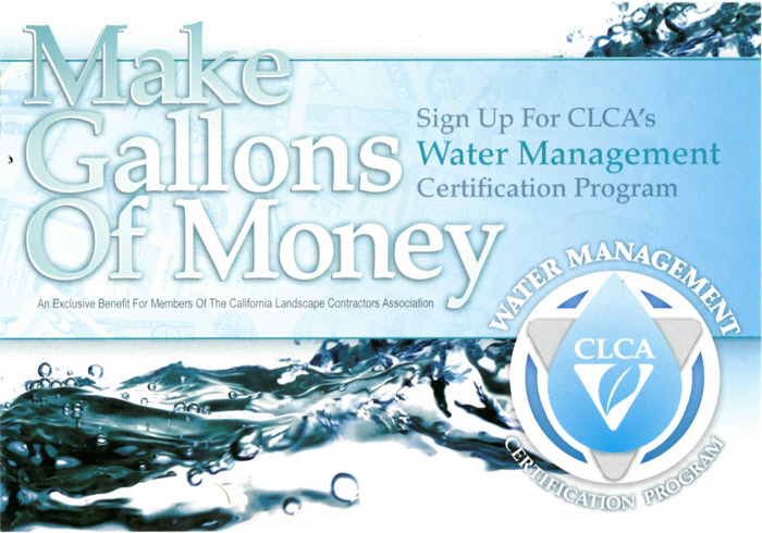
The materials targeted at California homeowners consisted of flyers, a booklet, and homeshow exhibit graphics. The content of these pieces focused on the savings homeowners, specifically those on meters, could receive by hiring licensed contractors to calibrate and re-configure their irrigation systems.
Although conservative at best, clarity became the ultimate goal of the professional materials. The visual similarity of the newly-formed program to its 50-year-old parent successfully gave the program credibility with member contractors. The consumer side relied on high impact, full-bleed color to differentiate from generally plain flyers a homeowner might encounter at a garden show.
Process
The visual component of the professional half relied on metaphorical comparisons between stock photos of withering trees and withering profits, while the consumer offered elegant sustainable xeriscapes in place of lawn imagery more common to the association’s materials. In order to tie the Water Management’s branding to the parent Association, I chose to use the same typeface (Palatino) in its own logo and in the original consumer campaign.
Constraints
I designed the original program branding while still employed full time at CLCA. Since leaving the association in 2010, I was hired to continue the program's visual identity as the drought deepened. Many of the design and content decisions were made prior to my involvement, for better or worse. Sometime after 2010, the in-house designer took the professional materials in another direction altogether, which split the brand.
The timeline of these projects did not lend itself to anything remarkable, and those limited ideas tended to live on throughout future iterations. Left with hurried choices echoed through from the original design, my course of action was to maintain consistency across the series while iterating forwards as possible.
Outcomes
The Water Management Certification program certified hundreds California landscape professionals between 2008-2016, helping their businesses — and the state — weather the recession.

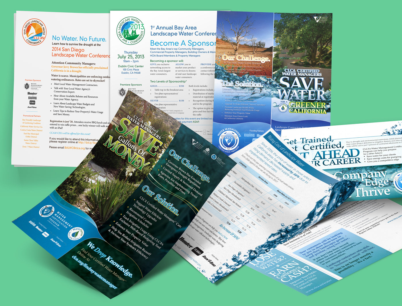
(above) Early campaign 4x6" postcards for direct mail, showing the shared relationship with the parent association's dated identity system.
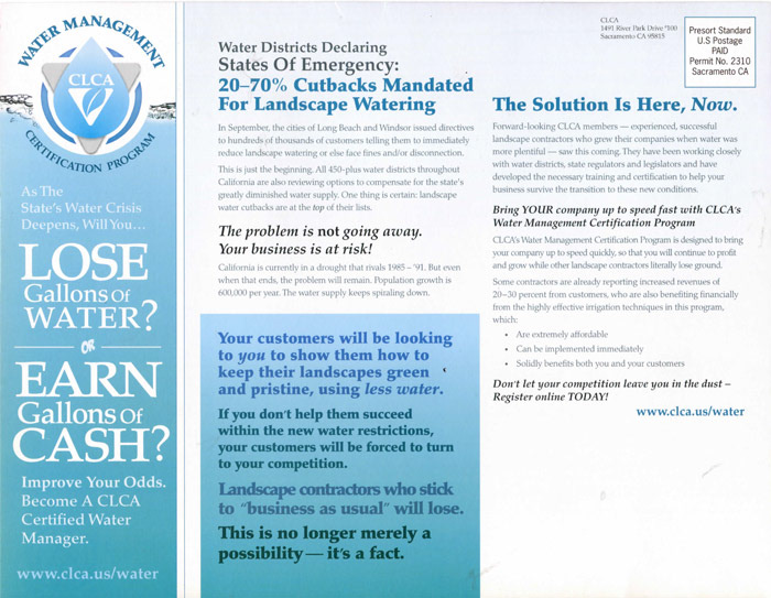
(above) Early campaign LTR direct mail piece (front and back).

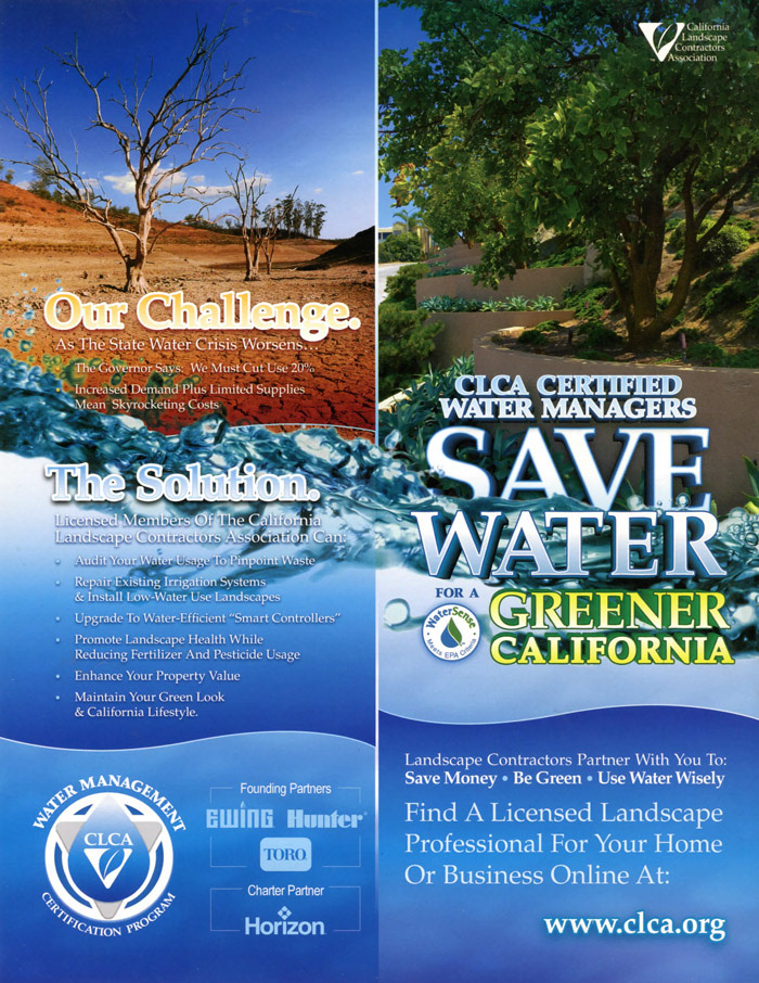
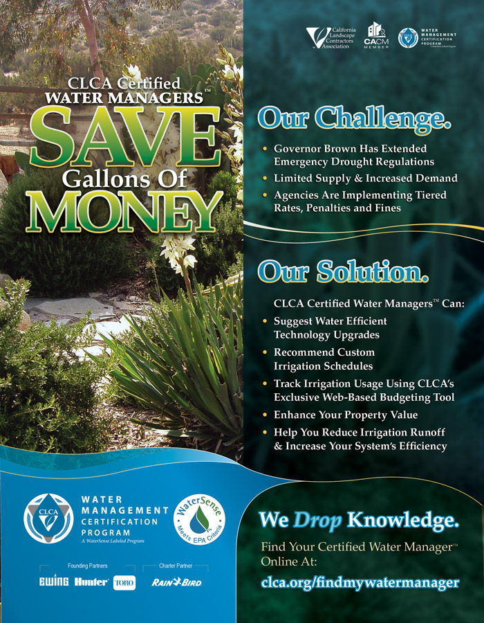
(above) LTR-sized direct mail postcards and magazine ads, showing the iterative progression of the series over time. Shown left-to-right chronologically, the left-most piece is representative of the industry-focused materials, while the other two elaborate on the wide postcard above in the consumer campaign.