California Landscape Contractors Association
Water Management Certification program
Water Management Certification program
Responsive Website Design
The California Landscape Contractors Association is a statewide professional organization representing licensed landscape contractors and the associated industries. Their Water Management Certification program responded to the deepening water crisis in California; training and certifying landscape professionals in water management best practices, as well as promoting their unique skills to homeowners.
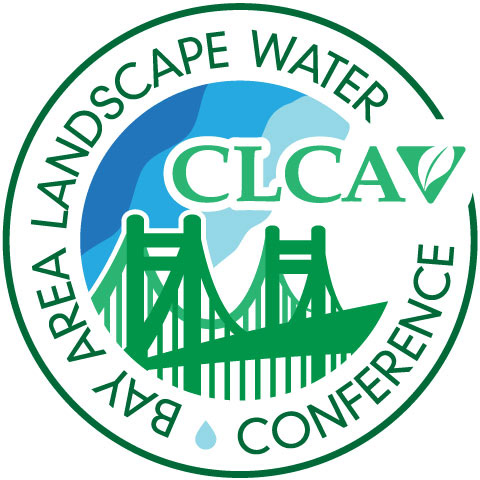
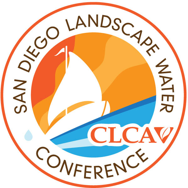
These one-page websites were created to promote the program’s two annual water conferences. Before each event, the content of each site encouraged attendance through an emphasis on educational offerings and access to members of local governance in attendance. Once the event has passed, the pages serve PDF slides of each presentation.
The visual identity of the sites relied heavily on the location of the events: the San Francisco Bay Area and Southern California. My original, circular logos played a prominent role in the page designs (used in 2012 – 2015), which forced more aggressive changes when the association’s current in-house designer re-imagined the mark more in the more linear, delicate design used in 2016.
Constraints
Budget and timeline for these small events was limited, so creative direction and content strategy took a backseat to making the pages lightweight and minimal for accessibility. (The presence of large PDF presentation files ran counter to these goals, but unavoidable.) Such lightweight, responsive webpages are as ideal for access on mobile devices by landscape professionals more commonly working in the field as they are for as well as for municipal workers, and property and HOA managers using desktop computers.
Process
In its earliest versions, the page design was dominated by a large “hero” image drawn from the parent program’s print visuals (which I also designed while still working in-house at CLCA nearly a decade ago). For future builds, this large asset created legibility issues but not enough visual emphasis to warrant the download on limited bandwidth. The most recent mobile-first build opted for a scalable vector images and a native gradient that required very little of the device. Although the aesthetic took on a more dated feel, the conservative use of image format, type choices and color scheme made space for a wealth of hierarchical difference without complicating the code or the reading experience. This economy improved readability as well as page performance, image quality, page speed and accessibility.
Outcomes
Through the use of these web pages and a related email campaign, the events enjoyed increasing participation year over year through the end of the governor’s state of emergency.